Building a Good Online Landing Page
Posted on January 16, 2012 by CJ Article Team
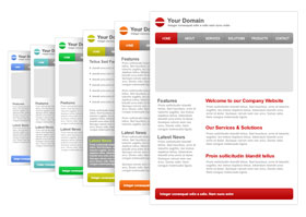
In starting a website, it is important to have a good idea of what your initial landing page looks like. What you want may not be the same thing people surfing the internet want.
One thing I’ve learned with internet marketing is the thing you are offering, the call to action has to be quick and simple. I’ve gotten certified for landing page optimization through Marketing Experiments, and attend seminars regularly. Here are a few things I’ve learned through them and my own readings:
For BtoC (business to consumer) Landing page optimization below are some items to consider.
If you are sending an email out to consumers, you need to be sure to:
- Make any repetition between email and website match: where logo/phone number is showing, pictures or banners, verbiage, etc
- Make it simple and concise. Give minimum amount of info on email, and prequalify on the landing page the consumer clicks through to.
- Make your email offer specific to the landing page the consumer clicks through to…be sure it is relevant.
- Need to have a good focus regarding a specific need. Carve out a niche
- If emailing to a current list of your own customers, address their specific needs. You will have a higher click through. Reconnect with the consumer for a specific offer.
- Colors should match when transitioning between pages
- If you are asking for information on the landing page, make sure the consumer knows exactly what they are getting for providing their email/number to avoid anxiety. (have a privacy protected logo and verbiage listed near the call to action)
- Avoid too much wordiness
- Eliminate anxiety
- Need to have in HTML or text: Simple intro text with clear links
- Have connection and good transition between email and landing page.
- Objective of an email is JUST to get a click and not overwhelm them with too much stuff in the first place.
- Make sure the landing page from email link is simple, don’t ask for too much information.
- Give the consumer a reason for requesting their private information, again reduce anxiety by offering a privacy protection promise.
For doing Paid Search:
- What is the value proposition for the consumer to click through from the ad to the landing page?
- Be specific with your keyword in the ad and the landing page. Need to carve out a niche.
- Don’t be too general, it will make people click on/off your site and you will pay for those erroneous clicks.
- On the landing page, give immediate reason why the consumer should be on your site. Why are you better/different?
- Make sure transition from click to page makes sense.
- Find a way to give something for free
- use verbiage like: “set up your free access” words and stuff like that to compel the consumer
- You can ask for contact info next to free offer
- Do not use the word “free” in ad. Do on landing page. Free is not allowed by Google.
ORGANIC Search:
- Try not to mess too much with text. You rank for the text you have in your site, so if you are already ranking, try not to change too much.
- Make large titles with some smaller text
- Make sure call to action, value proposition
- Get a good headline
- Have some credibility to build consumer trust on your landing page. Use lower right hand real estate on page for this.
- Use a compelling call to action, such as: Subscribe here for your free list of a gajillion names/sites! Or your free calculator, or free joke of the day, etc.
- Have a primary headline, a few subheadlines and use bullet points
- Drive visitors eyes into offer, into the call to action.
- Make call to action in upper middle section of landing page, right where the eye should rest.
- On third page, if they do answer a certain question and provide their information on your initial landing page or second page, qualify the consumer even more on a third page (the consumer can continue or leave from the information page) for the sales team to easily close the deal….however that is done.
Article Source: http://EzineArticles.com/1984359
Facebook Comments:


